💡 Today’s Creative Hit: “The High Contrast Problem/Solution Ad”
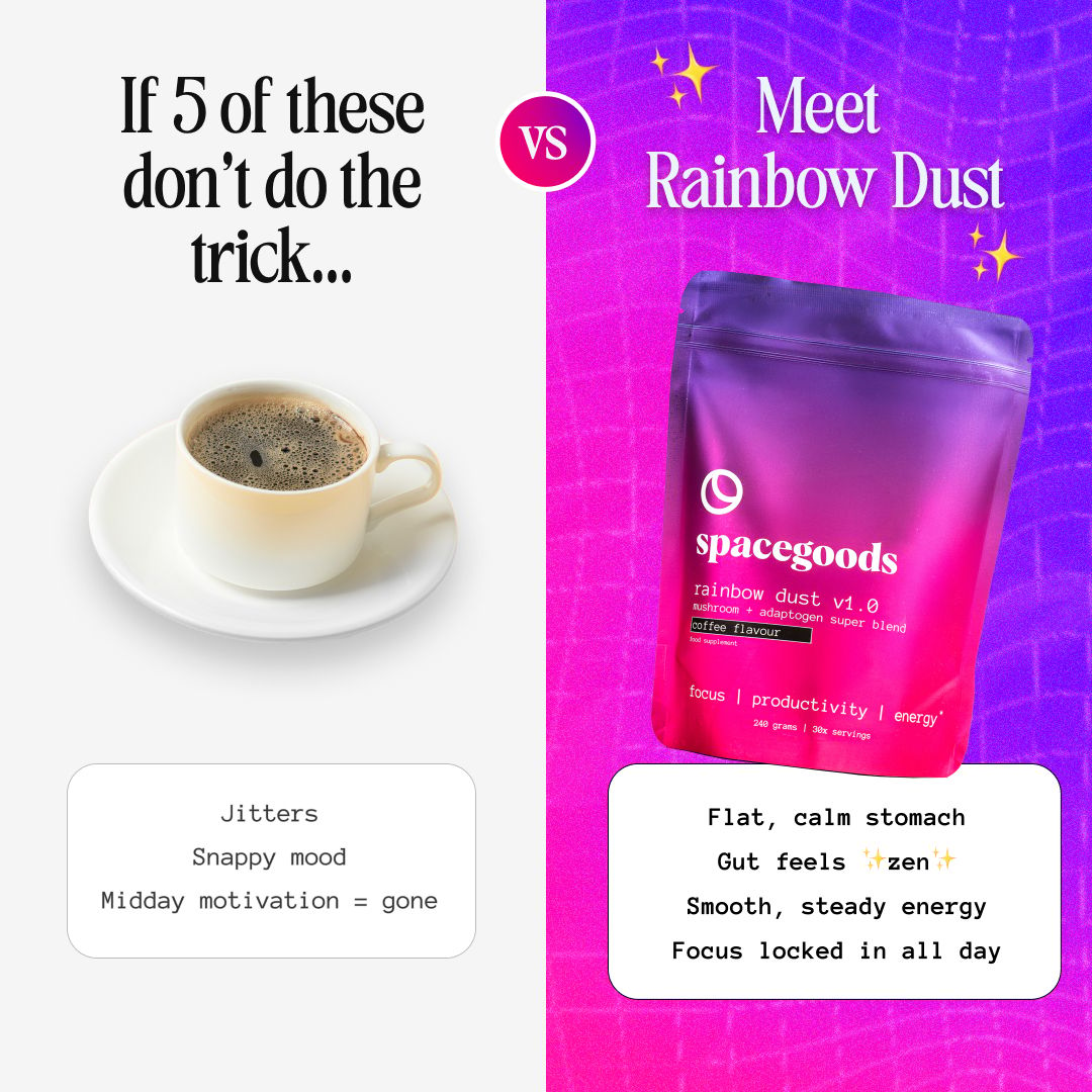
This static ad from Spacegoods is a masterpiece on showing a clear problem and solution style ad creative. Here’s why it’s working so well…

🖼 Visuals & Branding
Coffee side = grayscale, dull background, plain image.
Rainbow Dust side = vibrant purple/pink gradient, energetic and futuristic.
The contrast in color psychology amplifies the product’s positioning: old vs new, boring vs exciting, jittery vs smooth
📏 Ad Creative Breakdown:
1. The Hook (Left Side: “If 5 of these don’t do the trick…”)
Why it works:
Immediately challenges a common pain point of coffee drinkers: drinking multiple cups but still crashing.
Uses a conversational “if/then” setup that creates curiosity and tension, pulling the reader to look at the “solution” on the right side.
Visual of a plain coffee cup reinforces the “boring old solution” people already know.
2. The Contrast (Coffee vs. Rainbow Dust)
Why it works:
The “VS” split-screen format is a proven ad creative structure. It makes the message instantly scannable and easy to digest.
On the left: negative framing → Jitters, snappy mood, motivation gone.
On the right: positive framing → Calm stomach, zen gut, smooth energy, locked focus.
By pairing the two side-by-side, the viewer can’t help but make the mental switch: “This new thing must be better.”
3. Copywriting Choices
Left (Coffee):
Short, blunt negatives → “Jitters” / “Snappy mood” / “Motivation gone.”
Designed to trigger recognition (anyone who drinks coffee has felt this).
Right (Rainbow Dust):
Benefit-driven, sensory words → “Calm stomach” / “Gut feels ✨zen✨ / “Smooth, steady energy.”
Notice the emojis (✨) → casual, relatable, and scroll-stopping in a feed.
🎯 Why It Converts:
Clear “Problem → Solution” framing: Traditional coffee is the problem, Rainbow Dust is the fix.
Category education baked into the creative: Even if you’ve never heard of mushroom/adaptogen blends, you understand the “why” instantly—better energy, fewer side effects.
Aspirational promise: Focus locked in all day (a productivity upgrade vs. just a drink).
⚡ Quick Creative Tips
This ad is a masterclass in split-screen comparison creatives.
If your product replaces or upgrades a daily habit (coffee, skincare, supplements, gym gear), this format works because:
You highlight the pain of the old way.
You position your product as the better, new way.
You use visual contrast (color, copy, design) to make the difference unmissable.
👋 Work With Me
If you want performance focused static Meta Ads creatives like this for your brand:
Fresh batches every month.
Designed with data-backed persuasion principles.
Delivered ready-to-upload into Meta Ads manager.
Our best fit clients are spending $10k+/month already and need more fuel for their Meta Ads campaigns.
